Interior Design — Müller Optik

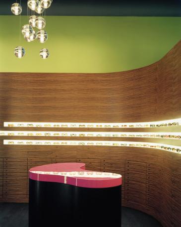
Müller Optik optician store eyewear display wall in ovangkol and counter in smoked oak and top in pink

Round shapes and warm natural tones

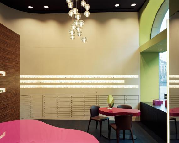
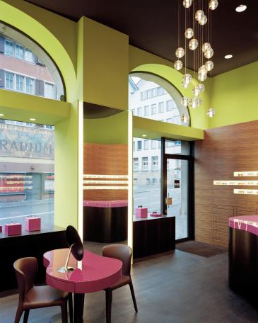
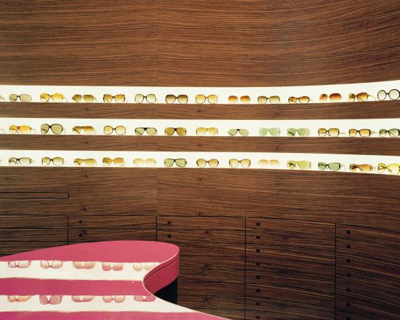
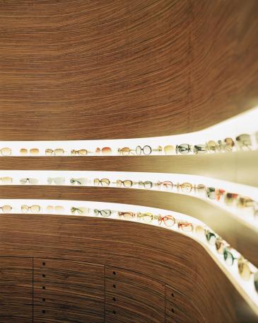
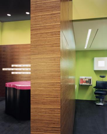
Müller optician’s store has a compact sales floor, so clever use of the available space was of the essence: two rounded walls are positioned in relation to each other to form the sales room and the examination room behind it, making the space feel larger than its dimensions would suggest. The striking surfaces feature natural tones and wood, creating an almost familial atmosphere with their warm medley of colours. The kidney-shaped sales counters provide a colour contrast. With their shiny pink finish, the counters seem to float like clouds in the atmospheric sales room.
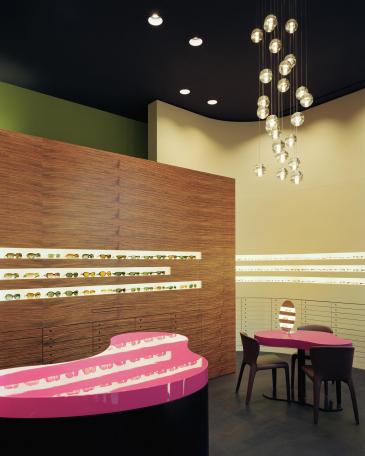
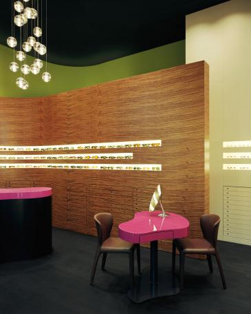
 

Müller Optik optician store showroom eyewear display wall in ovangkol and coloured consulting tables
Müller Optik optician store showroom with consulting tables in pink and chandelier from Bocci
Müller Optik optician store showroom with consulting tables in pink and eyewear display wall at the back
Müller Optik optician store showroom with consulting tables in pink and big backlighted mirror
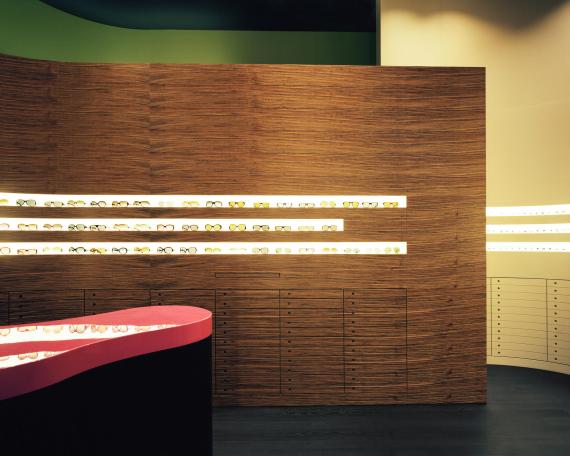
Müller Optik optician store detail eyewear display wall and counter
Müller Optik optician store detail eyewear display wall in ovangkol
Müller Optik optician store detail eyewear display wall and counter in smoked oak with top in pink
Müller Optik optician store view to the showroom and the refraction room
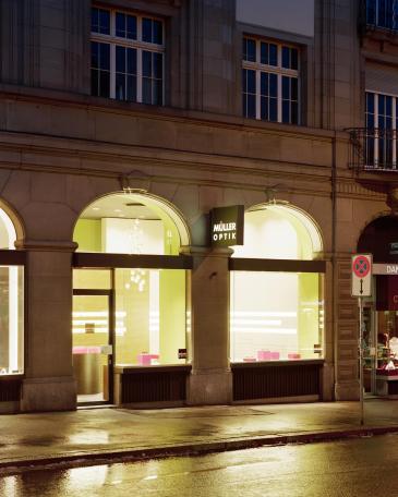
Müller Optik optician store outside view from the shop and display windows

Müller Optik

Conversion and redesign of the shop
Limmatquai, 8001 Zurich
Realisation 2008
Lighting Design Lichtblick
Photos Peter Tillessen


𐌎